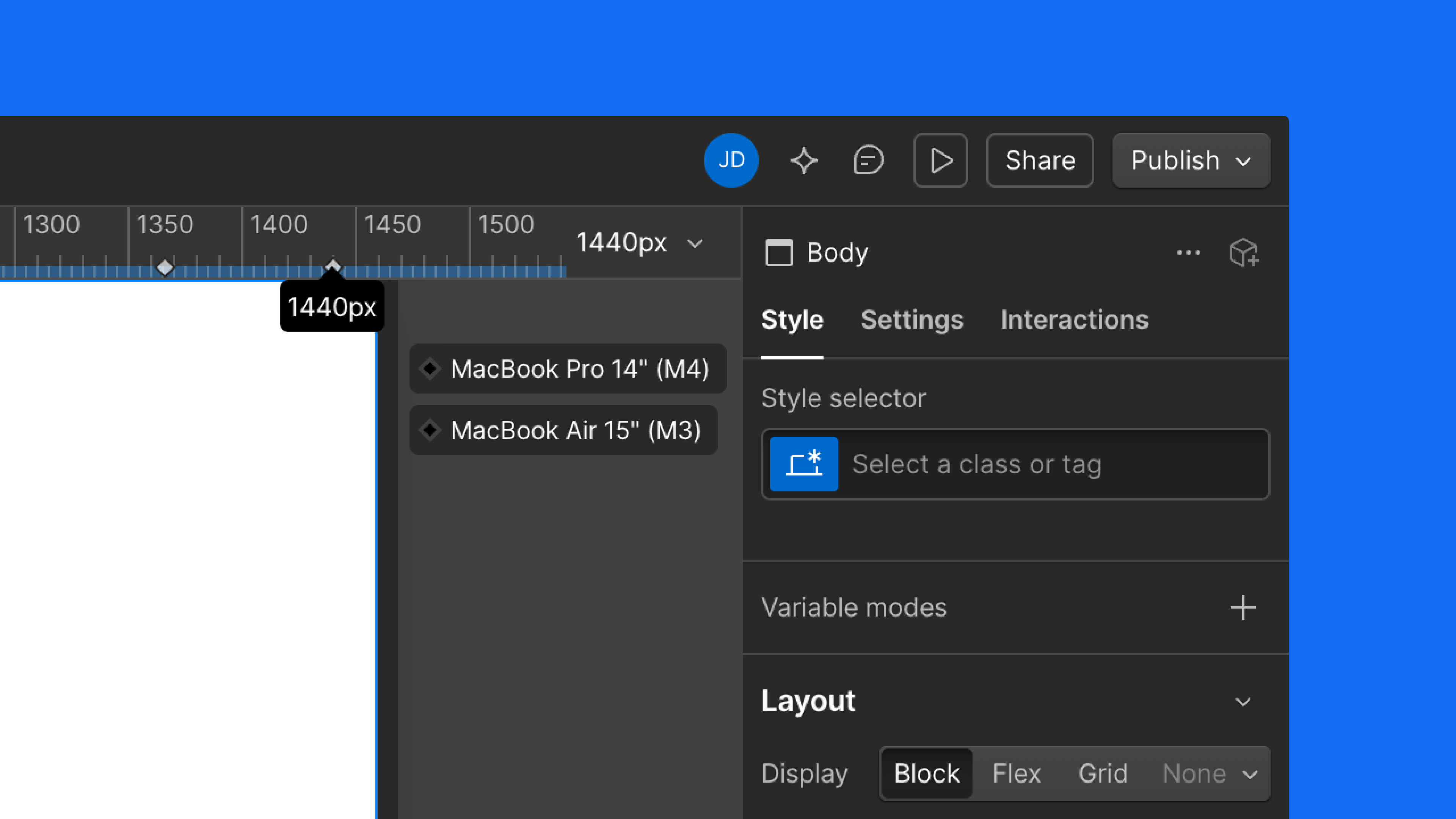
Designing to accurate viewports means fewer surprises between canvas and device. Now, every device marker on the canvas ruler reflects a real, modern screen. Widths are verified against manufacturer specs and on-device testing — 30 devices total, from phones and tablets to foldables, laptops, and monitors.
Default canvas widths have also changed. If your canvas look different at Mobile Portrait, Landscape, or Tablet, here's what shifted:
- Mobile Portrait: 393px (iPhone 16)
- Mobile Landscape: 667px (iPhone SE landscape)
- Tablet: 820px (iPad 10th gen)
Desktop and up are unchanged, and your published sites are't not affected.
Launched on
April 16, 2026
Category
Designer
.jpg)
.jpg)
.jpg)


.webp)


.webp)


.webp)


.webp)

.webp)


.webp)

.webp)
.webp)


.webp)


.webp)